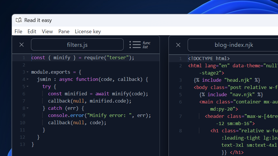
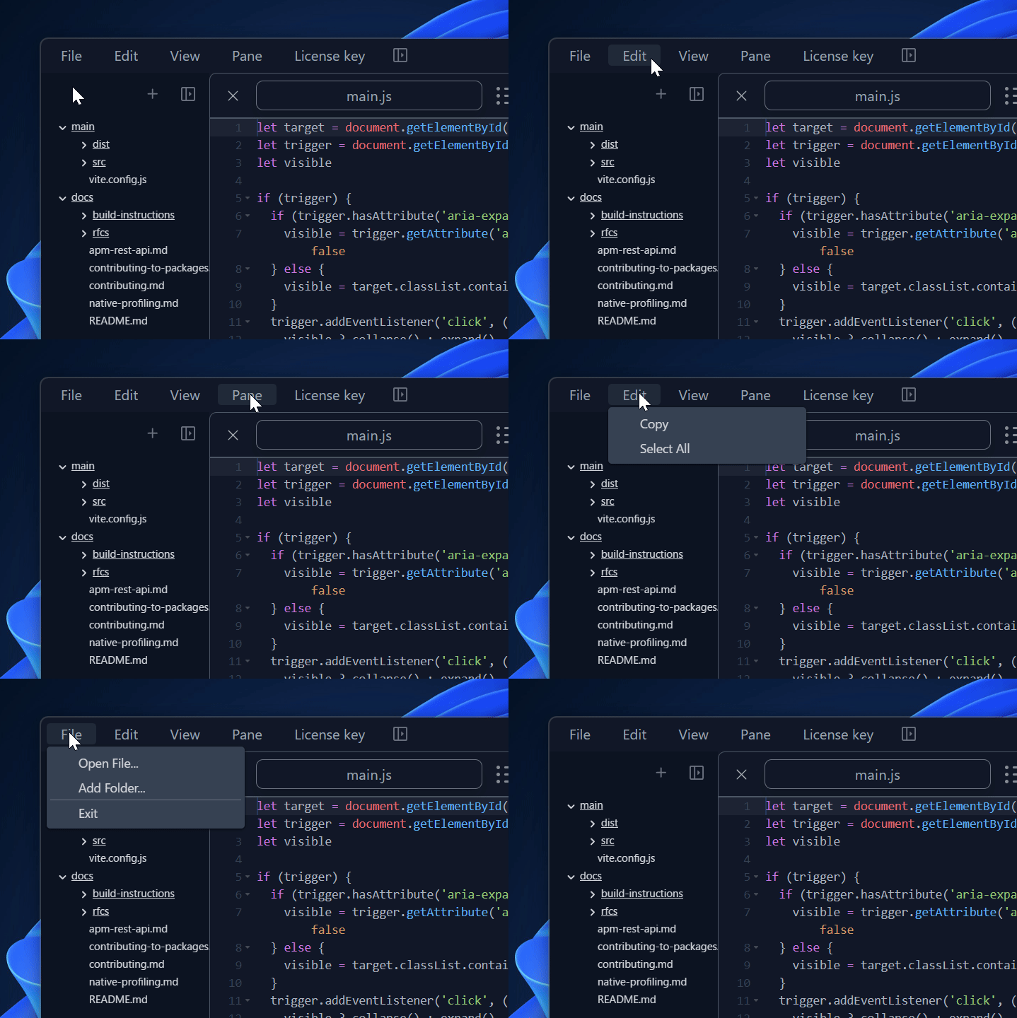
When launching an Electron app using BrowserWindow, both a default title bar and a default menu bar appear with the main web content. However, they don't always match the main web content because the OS applies the default color to them.

I removed the title bar and the menu bar and added a custom menu bar to my Electron app. There are some tips, especially when implementing the custom menu UI. The table below shows the five tasks to customize a menu bar of an Electron app for both Windows and macOS.
| step | task | Windows | macOS |
|---|---|---|---|
| 1 | remove the default title bar | ✔️ | ✔️ |
| 2 | add native window controls | ✔️ | - |
| 3 | add a custom menu bar | ✔️ | - |
| 4 | hide the custom menu bar | - | ✔️ |
| 5 | add the custom menu actions | ✔️ | - [1] |
Windows #
First, remove the default title bar. On Windows, both the native window controls and the menu bar disappear together with the title bar. So, the second step is to add native window controls. Set these changes in the main process. Next, add a custom menu bar in the renderer. Finally, add the actions to the custom menu.
macOS #
Remove the default title bar first. On macOS, the traffic lights on the app window and the default menu bar on the top of the screen don't disappear when the title bar is removed. There is no need to add traffic lights or a menu bar. The next step is to hide the custom menu bar on the app window since it has been added only for Windows. If the menu actions were implemented before this customization, this is done. There are no additional changes to the menu actions.
The hardest part for me was adding a custom menu bar because the menu's UI includes various behaviors of which I am usually unconscious. Anyway, let's get started!
Step1. Remove the default title bar #
  const window = new BrowserWindow({
    titleBarStyle: 'hidden',
  });
Add titleBarStyle: 'hidden' in BrowserWindow. This setting is common for Windows and macOS.
Step2. Add native window controls | Windows #
  const window = new BrowserWindow({
    titleBarStyle: 'hidden',
    titleBarOverlay: {
      color: '#1f2937',
      symbolColor: '#9ca3af',
      height: 36,
    }
  });
Add the titleBarOverlay option. The code above is the setting of my app. We can customize the options color, symbolColor, and height.
Step3. Add a custom menu bar | Windows #
Adding a custom menu bar needs to add
- A menu bar including main menus
- Submenus that belong to a main menu
- Interactions with main menus or submenus
Menu bar and main menus #
<div id="menubar" class="fixed left-0 top-0 w-full pl-2 flex menubar-drag bg-gray-900">
  <button type="button" class="focus:outline-none rounded px-4 my-2 text-gray-400 hover:bg-gray-800 menubar-nodrag cursor-default">File</button>
  <button type="button" class="focus:outline-none rounded px-4 my-2 text-gray-400 hover:bg-gray-800 menubar-nodrag cursor-default">Edit</button>
  <button type="button" class="focus:outline-none rounded px-4 my-2 text-gray-400 hover:bg-gray-800 menubar-nodrag cursor-default">View</button>
</div>
.menubar-drag {
-webkit-app-region: drag;
}
.menubar-nodrag {
-webkit-app-region: no-drag;
}The position of the menu bar is fixed because it always appears at the top of the app window. The main menus are buttons that receive clicks to open their submenus. They are highlighted by hovering. The area on the right side of the main menus is draggable, while the buttons for the main menus are not. This draggable area on the menu bar succeeds in the role of the default title bar.
Submenus #
<button type="button" class="focus:outline-none rounded px-4 my-2 text-gray-400 hover:bg-gray-800 menubar-nodrag cursor-default">File</button>
<div role="tooltip" class="hidden data-[show]:block rounded shadow shadow-gray-950 min-w-56 bg-gray-700">
  <ul class="px-1 py-1 text-sm">
    <li>
      <span class="block px-8 py-1 text-sm rounded hover:bg-gray-800 hover:text-gray-400">Open File...</span>
    </li>
    <li>
      <span class="block px-8 py-1 text-sm rounded hover:bg-gray-800 hover:text-gray-400">Add Folder...</span>
    </li>
    <li class="h-px bg-gray-500"></li>
    <li>
      <span class="block px-8 py-1 text-sm rounded hover:bg-gray-800 hover:text-gray-400">Exit</span>
    </li>
  </ul>
</div>
There are many ways to add submenus. In the code above, the submenus are in a list wrapped by a div element. By default, the initial app window hides the div element. The wrapper of the submenus needs to be next to the button of the main menu. The wrapper will behave as a tooltip. Each submenu is highlighted by hovering.
Interactions with main menus or submenus #
Typical behavior is better in terms of UX. I assume the menu's functional specifications are below.
- Show the main menus on the menu bar in order from left to right
- Open the submenus when a user clicks one of the main menus
- Close the submenus when a user clicks its main menu again
- Close the submenus when a user clicks the area outside them
- Highlight the main menu when it is hovered on
- Highlight the submenu when it is hovered on
- Open the submenus whose main menu is hovered on after a user clicks one of the main menus
The menu bar, the main menus, and the submenus have already met numbers 1, 5, and 6.
Open the submenus when a user clicks one of the main menus #
import { createPopper } from '@popperjs/core';

const menubar = document.querySelector('#menubar');
const buttons = menubar.querySelectorAll('button');
const showEvents = ['click'];

buttons.forEach((btn) => {
    let menu = btn.nextElementSibling;
    const popperInstance = createPopper(btn, menu, {
        modifiers: [
            {
                name: 'offset',
                options: {
                    offset: ({ reference, popper }) => {
                          return [(popper.width - reference.width) / 2 , 2];
                    },
                },
            },
        ],
    });
    showEvents.forEach((event) => {
        btn.addEventListener(event, (e) => {
            show(menu, popperInstance);
        });
    });
});

function show(tip, popper) {
    tip.setAttribute('data-show', '');
    popper.setOptions((options) => ({
    ...options,
    modifiers: [
        ...options.modifiers,
        { name: 'eventListeners', enabled: true },
    ],
    }));
    popper.update();
}
This example uses Popper.js. Popper.js shows and hides a tooltip of a reference. If the main menu button is a reference and the wrapper of the submenus is a tooltip, Popper.js makes a set of these menus behave as a dropdown menu. So, when a user clicks one of the main menus, the app can open the submenus.
Close the submenus when a user clicks its main menu again #
buttons.forEach((btn) => {

    showEvents.forEach((event) => {
        btn.addEventListener(event, (e) => {
            toggle(menu, popperInstance);
        });
    });
});

function hide(tip, popper) {
    tip.removeAttribute('data-show');
    popper.setOptions((options) => ({
        ...options,
        modifiers: [
        ...options.modifiers,
        { name: 'eventListeners', enabled: false },
        ],
    }));
}

function toggle(tip, popper) {
    tip.getAttributeNames().includes('data-show') ? hide(tip, popper) : show(tip, popper);
}
This spec demands a toggle function. toggle replaces show.
Close the submenus when a user clicks the area outside them #
const hideEvents = ['blur', 'focusout', 'dblclick'];

buttons.forEach((btn) => {

    hideEvents.forEach((event) => {
        btn.addEventListener(event, () => {
            hide(menu, popperInstance);
        });
    });
});
This spec demands the interaction for blur. Additionally, the interaction for focus out and double click on the main menu button should be the same as the one for blur. The app hides the submenus when the app window or the main menu button receives these events.
Open the submenus whose main menu is hoved on after a user clicks one of the main menus #
This spec is complicated.

Knowing which submenus are opened is necessary to meet this spec. State management can do this.
let focusedElement = {focused: false};

function toggleFocused(btn) {
    if (focusedElement.focused && focusedElement.button === btn) {
        focusedElement.focused = false;
        btn.classList.remove('bg-gray-800');
    } else {
        focusedElement.focused = true;
        btn.classList.add('bg-gray-800');
    }
}

function replaceFocusedElement(btn, tip, popper) {
    if (focusedElement.button) focusedElement.button.classList.remove('bg-gray-800');
    focusedElement.button = btn;
    if (focusedElement.button) focusedElement.button.classList.add('bg-gray-800');
    focusedElement.tip = tip;
    focusedElement.popper = popper;
}
The variable focusedElement contains the state of the current opened submenus. focused is set to true after a user clicks one of the main menus. toggleFocused toggles both focused and the background color of the main menu button. replaceFocusedElement replaces the state of the current opened submenus.
buttons.forEach((btn) => {

    // hover after clicking a button
    btn.addEventListener('mouseover', (e) => {
        if(focusedElement.focused) {
            toggle(focusedElement.tip, focusedElement.popper);
            toggle(menu, popperInstance);
            replaceFocusedElement(e.currentTarget, menu, popperInstance);
        }
    });
});
After a user clicks one of the main menus, focused is set to true. While focused is true, the previously opened submenus close, and the current submenus open whenever hovering on one of the main menu buttons. The main menu button of the currently opened submenus is set to "focused element" by replaceFocusedElement.
Step4. Hide custom menu bar | macOS #
const menubar = document.querySelector('#menubar');

if (isMac) {
  menubar.classList.add('hidden');
}
The custom menu bar on the app window is only for Windows. On macOS, hide it.
Step5. Add custom menu actions #
On macOS, you need not make any additional changes if you've already implemented the actions of the menu in your Electron app.
const openFileBtn = menubar.querySelector('li#open-file');

openFileBtn.addEventListener('mousedown', openFile);
On Windows, listen to the click events on the submenus and handle the actions about them.
Wrap up #
This article explained how to remove the default title bar and add a menu bar in an Electron app. There are some differences between Windows and macOS after removing the default title bar. Though we see a menu bar every day, its fundamentals are not so easy. I learned a lot and was satisfied with the new design of my app. Thank you for reading!
No additional changes if you've already implemented the menu actions in your Electron app. ↩︎